
https://blog.youworkforthem.com/2016/02/15/history-franklin-gothic/
Morris Fuller Benton (ATF) created the original version in 1902. The typeface found its influence in Akzidenz Grotesk types. Benton named it as a homage to Benjamin Franklin (founding father of USA) who was a typesetter as well. The type uses Time magazine, The New York Times. American and Canadian Scrabbles use the font on titles. Films Rocky and StarWar and logos like Showtime and Bank of America as well.
https://www.fonts.com/font/itc/itc-franklin-gothic/story
In the fine art, Franklin Gothic is the official typeface of the Museum of Modern Art in New York City and in pieces Lawrence Weiner's art. In promotional materials of "The Dark Knight" and logos TNT, CBS sports, ESPN. The music albums of Lady Gaga and Van Morrison have the font as well.
Bodoni Typeface
https://www.youworkforthem.com/font/T3729/bodoni
https://www.fonts.com/font/linotype/bodoni/story
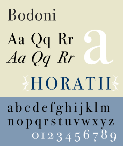
The font was designed by Giambattista Bodoni in 1798 and it is considered a "transitional" font type. Bodoni was influenced by the work of John Baskerville, a designer whose work Bodoni followed. The font where Q has centred tail and slight hook in the J. The font was widely accepted by printers and can be seen in publications since the late 1700s.
The movie poster Mama mia use the font, the movie poster Black Dahlia. In advertising Guerlain, Elizabeth Arden, Giorgio Armani, Calvin Klein. Magazine publication Harper's Bazzar, Metropolis and Elle use it for logo and titles.
Gill Sans Typeface

The typeface was designed by British designer Eric Gill. The roots can be traced to his teacher Edward Johnston, designed for the signage of the London Underground Railway. The proportion is classical with flared R and eyeglass lower g.

No comments:
Post a Comment