Labels

Showing posts with label Part Two Exercises. Show all posts

Friday, 26 April 2019

Exercise: Travel

First, I made a brief notion:


I needed information about what the coffee book looks like. I found some information on the internet and I decided to use 22x28 cm.

Second information which was not clear was: dynamic layout, what it is? I found only information about dynamic composition:
- add contrast
- define hierarch Larger/contrast = more important
- treat type as a shape

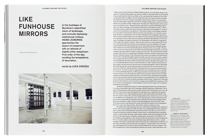
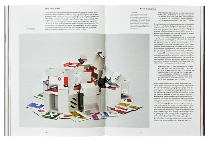
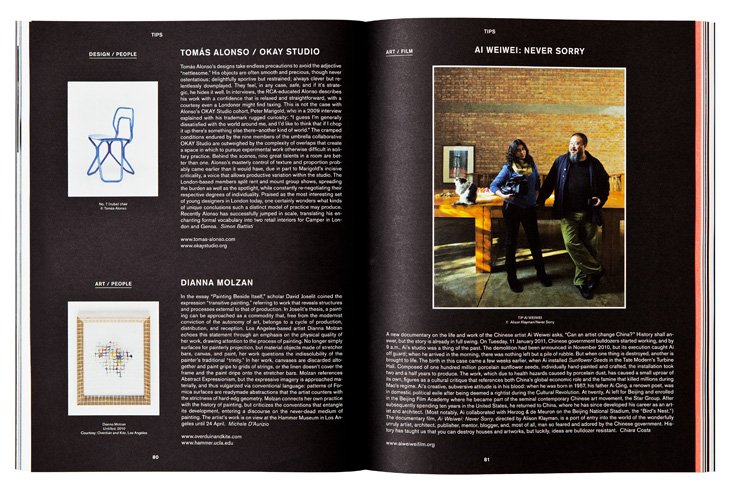
When I have done some thumbnails I tried them in Indesign. As an inspiration was the book Grid systems/Raster systeme by Josef Müller-Brockmann. I started with a simple 4x4 grid. I tried to fill the grid by text and pictures to my feelings that it looks good. After this grid, I tried a 3x6 grid. I was not satisfied even the layout does not look bad, still, there was a lack of compatibility, I think. So I get inspired by 8x3 two inner pages and I was happier. I really like the picture situated in the middle of two pages. Especially I like 6. 7. layouts where is only one picture with Berlin title and 8. layout where are added some texts. It is clean with enough white space. There is a nice contrast. I was playing with the last layouts. I wanted to wrap text around a shape and the Star of David was a great opportunity. The layout looks good. I think I could be more playing with the shape of type. I tried but it was a beginning. I am not sure about the font of the Travel title. Is not bad but fresher could be found I think.

Anyway, this exercise helps me to more understand how the grid is helpful to build a layout. I noticed that good layout leads an eye across the page. For example the 2. layout, the left page is a little bit messy, the eye is flying from Berlin to left paragraph. In layout 3., the situation is better. How to lead the eye is in layout 4, still, Berlin is a little bit disruptive. Layout 5. is the grid 8x3 for two pages and looks good. The possibility to put the picture in the middle is helpful for the balance of the layout. As there are some things to be adjusted, I am satisfied with the result. Next time I would like to focus on the shape of Type and better leading of the eye.

Here is the pdf file: Grids and Layouts

1. layout

2. layout

3. layout

4. layout

5. layout

6. layout

7. layout

8. layout

9. layout

10. layout

11. layout


Friday, 5 April 2019

Exercise: White space

Sources:
https://www.dgtlnk.com/blog/importance-white-space/

These layouts are what I consider at this moment as a good layout with enough space between objects and negative space.


Graphic designers:

Vince Frost:
Výsledek obrázku pro Vince FrostVýsledek obrázku pro Vince Frost


Fillippo Nostri

http://sgustokdesign.com/studio-filippo-nostri-kaleidoscope-magazine


Christiane Feser


I choose Andy Warhol as the artist for the catalogue. I wanted the catalogue to be as simple as possible. My first intention was to try some brake rules layout but I made a simple layout and stuck to it the whole process. It is easy to see a layout as inspiration but it is not easy to apply it. I like the result. Anyway, I would like to try more combinations with text. 

Here is a link to a pdf file of the Andy Warhol Catalogue

I did not put pagination because I thought it is not a necessary element to see Andy's works. I did not finish the last page and I think I could out more text there. Anyway, let the reader think about the work.


Sunday, 10 March 2019

Exercise Key characters: Typography Insight again Helvetica vs Ariel

I wanted to see what differences are between Helvetica and Ariel. There are fonts which are very close and there are fonts such as 3 @ R and G which makes the typefaces visibly different.


Exercise: Key characters: Adobe's Typography Insight application


I found this application already installed on my tablet. It is a great application to discover basics, anytomy, history, typesetting, comparison. Really great application. Nice how the typefaces involved from humanist to grotesk - sans serif.


Sunday, 24 February 2019

Exercise: Type samples

As I was searching to get inspiration in other samples sheets I came across interesting links:

http://www.steptoandson.co.uk/services/10-great-web-font-combinations/

https://creativemarket.com/blog/10-infographics-on-how-to-mix-fonts-like-a-pro

http://typecast.com/blog/the-voices-of-type

I have read interesting work by Michael Peterson Rhetoric of Typography: Cross-Cultural Perceptions of Typefaces for Technical and Visual Communication. The work search differences how Korean and non-Koreans perceive typefaces. Michael focused his thesis to exam cultural perceptions of typefaces. His thesis helped me to better understand what is the cultural side of typeface perception. How the type can create a sense of meaning according to readers responds. Swirling type on movie poster may evoke romance, whereas bold type may say action-spy movie. Times New Roman is connected with professionalism because it is a common typeface of professional documents. The thesis describes the progress from writing typeface (Gutenberg) to the simplified versions (Russian Constructivism, De Stijl, Bauhaus). There is a notion about Fette Fraktur typeface connected to the rise of Nazis. The result of the thesis shows there is a different cultural perception of the typeface. It helped me to understand that the cultural perception is important to share meaning through the typefaces and what is more the typeface may not be perceived the same in the different country.

The second thesis I found is about Cultural investigation on typography in branding in the United States and in Brazil. The great thesis which shows the differences between typefaces perceived in Brazilia and USA. The examples of what people from different country perceives as their cultural branding are surprizing. "Semiotics provides the understanding of typography as a visual element loaded with meanings and symbolical information in their form (Skaggs). Psychology supplies the awareness of how the semiotic meaning affects human perception and the moods that each class of typography can create depending on the forms and shapes of the letter. The third element -culture- explain how the effect that type creates on the viewer can be related to intrinsic characteristics of particular cultural identity." There is a section where typeface are divided into ten categories and its mood. Interesting is how the culture of both countries are described: Brazilian culture: friendly, happy, warm and diverse and the American culture: strong, confident, and modern. There are great examples which show the differences. The thesis supported me more to understand that typeface has a tremendous impact on readers.

I choose as a first typeface FUTURA PT mainly for its geometry.


As a next typeface, I want a serif typeface. I choose one of the Adobe typefaces. I was looking for a nice looking one and good to read. I like the Capitolium2 for its shapes. I wanted to show combinations of the shapes as in the Futura sheet. I like the combinations of the J and curly bracket. When I was playing with the shapes I discovered that the shapes of O and J descender are similar, the same the 6 and ascender of J, nice.


The final typeface is a script. I wanted some which look nice and close to a handwritten one. P22 sneaky is very nice written typeface, warm and nice to read. I discovered that s a little bit strange. Anyway, the combinations of the fonts created a nice feeling.