https://www.dgtlnk.com/blog/importance-white-space/
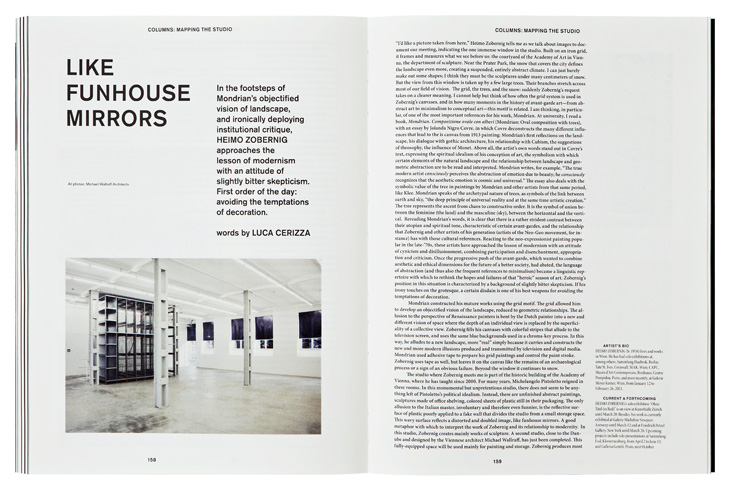
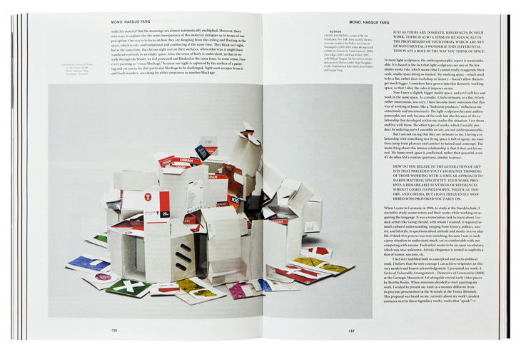
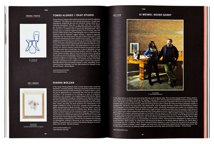
These layouts are what I consider at this moment as a good layout with enough space between objects and negative space.
Graphic designers:
Vince Frost:


Fillippo Nostri
http://sgustokdesign.com/studio-filippo-nostri-kaleidoscope-magazine


Christiane Feser
I choose Andy Warhol as the artist for the catalogue. I wanted the catalogue to be as simple as possible. My first intention was to try some brake rules layout but I made a simple layout and stuck to it the whole process. It is easy to see a layout as inspiration but it is not easy to apply it. I like the result. Anyway, I would like to try more combinations with text.
Here is a link to a pdf file of the Andy Warhol Catalogue
I did not put pagination because I thought it is not a necessary element to see Andy's works. I did not finish the last page and I think I could out more text there. Anyway, let the reader think about the work.


No comments:
Post a Comment