Sunday, 24 February 2019

Exercise: Type samples

As I was searching to get inspiration in other samples sheets I came across interesting links:

http://www.steptoandson.co.uk/services/10-great-web-font-combinations/

https://creativemarket.com/blog/10-infographics-on-how-to-mix-fonts-like-a-pro

http://typecast.com/blog/the-voices-of-type

I have read interesting work by Michael Peterson Rhetoric of Typography: Cross-Cultural Perceptions of Typefaces for Technical and Visual Communication. The work search differences how Korean and non-Koreans perceive typefaces. Michael focused his thesis to exam cultural perceptions of typefaces. His thesis helped me to better understand what is the cultural side of typeface perception. How the type can create a sense of meaning according to readers responds. Swirling type on movie poster may evoke romance, whereas bold type may say action-spy movie. Times New Roman is connected with professionalism because it is a common typeface of professional documents. The thesis describes the progress from writing typeface (Gutenberg) to the simplified versions (Russian Constructivism, De Stijl, Bauhaus). There is a notion about Fette Fraktur typeface connected to the rise of Nazis. The result of the thesis shows there is a different cultural perception of the typeface. It helped me to understand that the cultural perception is important to share meaning through the typefaces and what is more the typeface may not be perceived the same in the different country.

The second thesis I found is about Cultural investigation on typography in branding in the United States and in Brazil. The great thesis which shows the differences between typefaces perceived in Brazilia and USA. The examples of what people from different country perceives as their cultural branding are surprizing. "Semiotics provides the understanding of typography as a visual element loaded with meanings and symbolical information in their form (Skaggs). Psychology supplies the awareness of how the semiotic meaning affects human perception and the moods that each class of typography can create depending on the forms and shapes of the letter. The third element -culture- explain how the effect that type creates on the viewer can be related to intrinsic characteristics of particular cultural identity." There is a section where typeface are divided into ten categories and its mood. Interesting is how the culture of both countries are described: Brazilian culture: friendly, happy, warm and diverse and the American culture: strong, confident, and modern. There are great examples which show the differences. The thesis supported me more to understand that typeface has a tremendous impact on readers.

I choose as a first typeface FUTURA PT mainly for its geometry.


As a next typeface, I want a serif typeface. I choose one of the Adobe typefaces. I was looking for a nice looking one and good to read. I like the Capitolium2 for its shapes. I wanted to show combinations of the shapes as in the Futura sheet. I like the combinations of the J and curly bracket. When I was playing with the shapes I discovered that the shapes of O and J descender are similar, the same the 6 and ascender of J, nice.


The final typeface is a script. I wanted some which look nice and close to a handwritten one. P22 sneaky is very nice written typeface, warm and nice to read. I discovered that s a little bit strange. Anyway, the combinations of the fonts created a nice feeling.


Tuesday, 19 February 2019

Ellen Lupton, Thinking with Type


It was great repetition around the type to read Lupton's book. I appreciated parts about Kerning and Tracking and their examples, the expression of the word meaning through the spacing, sizing and placement of letters on the page.

Thanks to this book I bought a book Don't make me think by Steve Krug. It is an area for further discovery of web usability.


Tuesday, 12 February 2019

Research Point - Explore typography

I found that article about 10 modern independent type foundries:

10-modern-independent-type-foundries

I like the notion about the monolithic corporate behemoths like Monotype or Adobe. I have access to adobe font stock and is true it is not easy to choose a type because there are thousands of them.

What a surprise to see a small range of fonts together on that web page: https://klim.co.nz/


These typefaces spoke to me. Founders Grotesk looks gently. I can imagine this typeface in a luxury magazine as a head font.


I compared this typeface with SWISS 721 typeface I use a lot. The gentleness is achieved by small differences in ascender it is visible at t alphabet.


This font has vertical finials.


This font reminds me of Bodoni typeface. The weight between vertical and horizontal lines is extreme.


eee


https://sharptype.co/typefaces/sharp-sans/

Nice Sans serif typeface. I like the slant finials.


https://www.swisstypefaces.com/lab/

An interesting typeface, really reminds magic, looks good to be a headline of a poster.


https://lineto.com/

A typeface created by lines. For what I could use it? :-)


Tuesday, 15 January 2019

Research Point - typefaces

Typeface Franklin Gothic

FranklinGothicSP.svg

https://blog.youworkforthem.com/2016/02/15/history-franklin-gothic/

Morris Fuller Benton (ATF) created the original version in 1902. The typeface found its influence in Akzidenz Grotesk types. Benton named it as a homage to Benjamin Franklin (founding father of USA) who was a typesetter as well. The type uses Time magazine, The New York Times. American and Canadian Scrabbles use the font on titles. Films Rocky and StarWar and logos like Showtime and Bank of America as well.

https://www.fonts.com/font/itc/itc-franklin-gothic/story

In the fine art, Franklin Gothic is the official typeface of the Museum of Modern Art in New York City and in pieces Lawrence Weiner's art. In promotional materials of "The Dark Knight" and logos TNT, CBS sports, ESPN. The music albums of Lady Gaga and Van Morrison have the font as well.


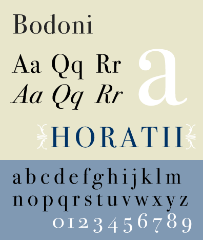
Bodoni Typeface

https://www.youworkforthem.com/font/T3729/bodoni
https://www.fonts.com/font/linotype/bodoni/story


The font was designed by Giambattista Bodoni in 1798 and it is considered a "transitional" font type. Bodoni was influenced by the work of John Baskerville, a designer whose work Bodoni followed. The font where Q has centred tail and slight hook in the J. The font was widely accepted by printers and can be seen in publications since the late 1700s.

The movie poster Mama mia use the font, the movie poster Black Dahlia. In advertising Guerlain, Elizabeth Arden, Giorgio Armani, Calvin Klein. Magazine publication Harper's Bazzar, Metropolis and Elle use it for logo and titles.


Gill Sans Typeface

GillSansEG.svg

The typeface was designed by British designer Eric Gill. The roots can be traced to his teacher Edward Johnston, designed for the signage of the London Underground Railway. The proportion is classical with flared R and eyeglass lower g.