Friday, 26 April 2019

Exercise: Travel

First, I made a brief notion:


I needed information about what the coffee book looks like. I found some information on the internet and I decided to use 22x28 cm.

Second information which was not clear was: dynamic layout, what it is? I found only information about dynamic composition:
- add contrast
- define hierarch Larger/contrast = more important
- treat type as a shape

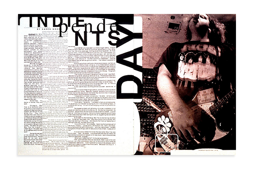
When I have done some thumbnails I tried them in Indesign. As an inspiration was the book Grid systems/Raster systeme by Josef Müller-Brockmann. I started with a simple 4x4 grid. I tried to fill the grid by text and pictures to my feelings that it looks good. After this grid, I tried a 3x6 grid. I was not satisfied even the layout does not look bad, still, there was a lack of compatibility, I think. So I get inspired by 8x3 two inner pages and I was happier. I really like the picture situated in the middle of two pages. Especially I like 6. 7. layouts where is only one picture with Berlin title and 8. layout where are added some texts. It is clean with enough white space. There is a nice contrast. I was playing with the last layouts. I wanted to wrap text around a shape and the Star of David was a great opportunity. The layout looks good. I think I could be more playing with the shape of type. I tried but it was a beginning. I am not sure about the font of the Travel title. Is not bad but fresher could be found I think.

Anyway, this exercise helps me to more understand how the grid is helpful to build a layout. I noticed that good layout leads an eye across the page. For example the 2. layout, the left page is a little bit messy, the eye is flying from Berlin to left paragraph. In layout 3., the situation is better. How to lead the eye is in layout 4, still, Berlin is a little bit disruptive. Layout 5. is the grid 8x3 for two pages and looks good. The possibility to put the picture in the middle is helpful for the balance of the layout. As there are some things to be adjusted, I am satisfied with the result. Next time I would like to focus on the shape of Type and better leading of the eye.

Here is the pdf file: Grids and Layouts

1. layout

2. layout

3. layout

4. layout

5. layout

6. layout

7. layout

8. layout

9. layout

10. layout

11. layout


Friday, 5 April 2019

Exercise: White space

Sources:
https://www.dgtlnk.com/blog/importance-white-space/

These layouts are what I consider at this moment as a good layout with enough space between objects and negative space.


Graphic designers:

Vince Frost:
Výsledek obrázku pro Vince FrostVýsledek obrázku pro Vince Frost


Fillippo Nostri

http://sgustokdesign.com/studio-filippo-nostri-kaleidoscope-magazine


Christiane Feser


I choose Andy Warhol as the artist for the catalogue. I wanted the catalogue to be as simple as possible. My first intention was to try some brake rules layout but I made a simple layout and stuck to it the whole process. It is easy to see a layout as inspiration but it is not easy to apply it. I like the result. Anyway, I would like to try more combinations with text. 

Here is a link to a pdf file of the Andy Warhol Catalogue

I did not put pagination because I thought it is not a necessary element to see Andy's works. I did not finish the last page and I think I could out more text there. Anyway, let the reader think about the work.


Wednesday, 3 April 2019

Research point - range of grids

This research reminded me of the Brockmann grids system which is a great guide on how to use texts and pictures in columns and lines within a page. However, I like more the "rebellion" which I saw in Zembla magazine. They use the grid system rules but with nice looking changes.

I think the grid system of Brockmann is perfect, no doubt, readable, in harmony. On the other side, the Zembla layout changes the feeling from mathematical, cold calculated layout into something more close to nature. It looks enhanced, shifted to another more beautiful state, I think.

Research:

I found that link with basic enough information about layout https://trydesignlab.com/blog/grids-ui-ux-graphic-design-quick-history-5-amazing-tips/#1 about grids.

I have a great book about the layout by Gavin Ambrose and Paul Harris as well the book Grid Systems in graphic design by Josef Müller-Brockmann.


Here is what I found:

Grid?
  1. Baseline line - used with column
  2. Column grid - symetric / asymetric - newspapers, magazines 
  3. Modular grid - magazines and corporate report, art books
  4. Manuscript grid - traditional books
  5. Pixel grid - screens
  6. Hierarchical grid - two superimposed grids
History of layout:

14th century: Lutrell Psalter
 Výsledek obrázku pro luttrell psalter

15th century:
Gutenberg's bible:
Výsledek obrázku pro gutenberg bible layout

15th century:
Geoffrey Chaucer: The Canterbury Tales
Geoffrey Chaucer, The Canterbury Tales ~ British Library

19th century:
The book Works of Geoffrey Chaucer by Kelmscott Press

Výsledek obrázku pro Kelmscott Chaucer

1913
The New York Times
The New York Times, 1914

Golden Harmony
Výsledek obrázku pro golden layout


Karl Gestner:


20th 50-60s
Müller-Brockmann
Modular, radial grid
Josef Mueller-Brockmann


Zembla magazine:
Výsledek obrázku pro zembla magazine
Výsledek obrázku pro zembla magazineVýsledek obrázku pro zembla magazine
Rebellion against grid 1970 - :
Wolfgang Weingart


David Carson - Ray Gun magazine
david_carson_interview_09