I think the grid system of Brockmann is perfect, no doubt, readable, in harmony. On the other side, the Zembla layout changes the feeling from mathematical, cold calculated layout into something more close to nature. It looks enhanced, shifted to another more beautiful state, I think.
Research:
I found that link with basic enough information about layout https://trydesignlab.com/blog/grids-ui-ux-graphic-design-quick-history-5-amazing-tips/#1 about grids.
I have a great book about the layout by Gavin Ambrose and Paul Harris as well the book Grid Systems in graphic design by Josef Müller-Brockmann.


Here is what I found:
Grid?
- Baseline line - used with column
- Column grid - symetric / asymetric - newspapers, magazines
- Modular grid - magazines and corporate report, art books
- Manuscript grid - traditional books
- Pixel grid - screens
- Hierarchical grid - two superimposed grids
14th century: Lutrell Psalter

15th century:
Gutenberg's bible:

15th century:
Geoffrey Chaucer: The Canterbury Tales

19th century:
The book Works of Geoffrey Chaucer by Kelmscott Press

1913
The New York Times

Golden Harmony

Karl Gestner:

20th 50-60s
Müller-Brockmann
Modular, radial grid

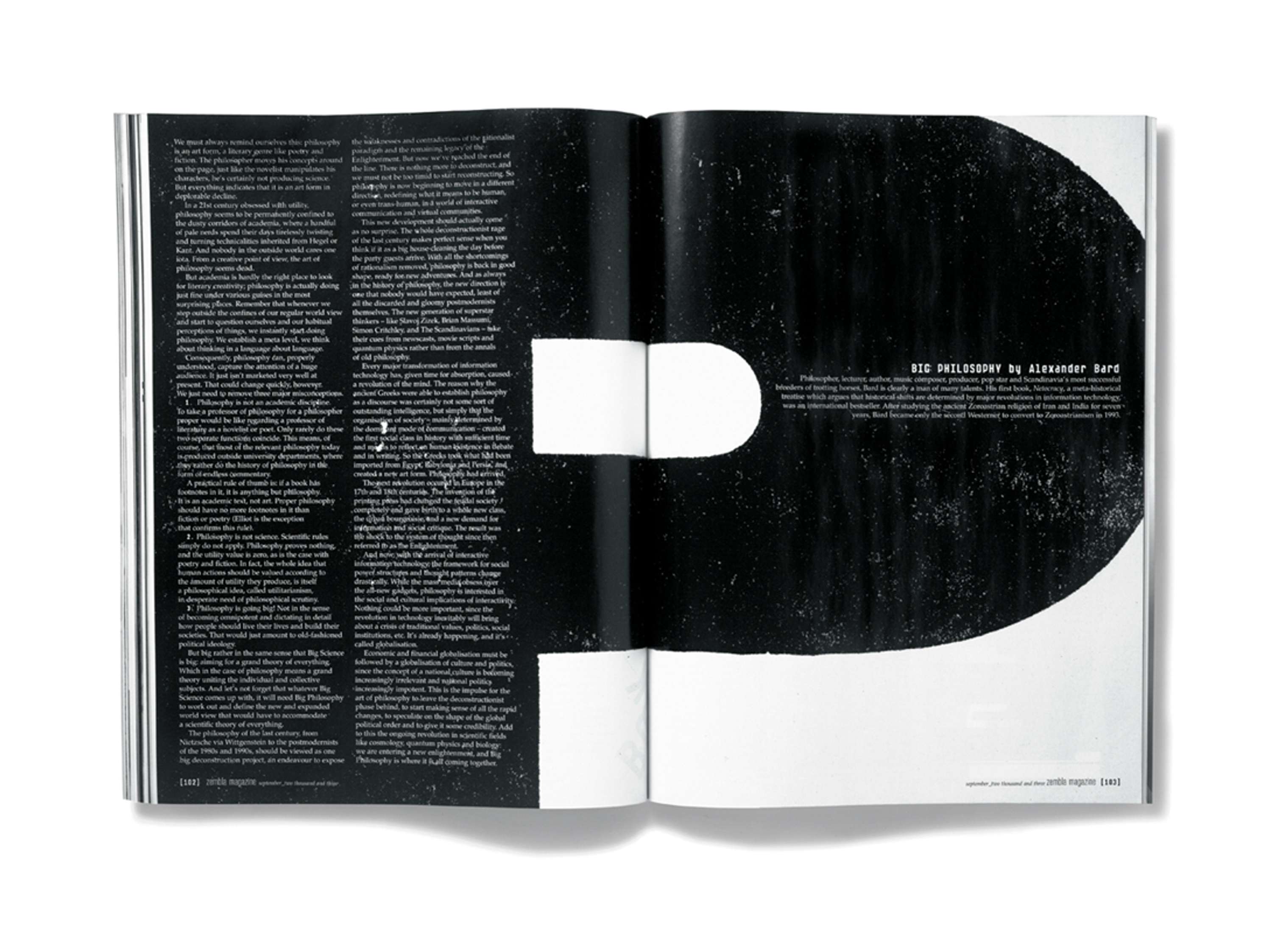
Zembla magazine:


Rebellion against grid 1970 - :
Wolfgang Weingart

David Carson - Ray Gun magazine
No comments:
Post a Comment